


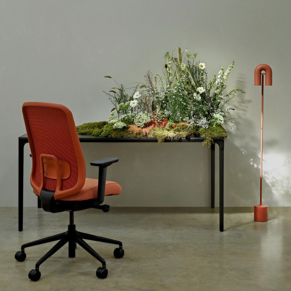
The newly launched Sia task chair is one of the most environmentally friendly products in its category, but it’s exciting for another reason too.
Sia is all about colour.
Instead of the usual black, Sia’s structural back frame can be specified in Copper Brown, Reed Green, Oyster White or Black as standard, with a choice of five styles of mesh that come in a further 64 colour combo options. Or, for orders over 200 units, Boss Design will manufacture Sia’s frame and mesh in just about any colour you want.
For the first time, ergonomic task seating can be colour coordinated with the wider palette used across an office décor scheme. Sia can be specified to reflect a client’s brand identity, and to promote the right look and feel for their office space.
Form, colour and style
Sia is among a range of new products from Boss Design that reflect our mission to create destination spaces. As part of that mission, we’ve been exploring with colour like never before and the colours we now use are a vital part of our own identity.
Soft, elegant and organic contours have been hallmarks of our design philosophy in recent years and we’ve been on a journey into the world of colour in order to come up with palettes to match. Earthy greens and browns are a part of that palette, evoking the natural world, with warm, autumnal reds, oranges and yellows.
If your first thought is of the 1970s, that era is certainly part of the inspiration. In a sense, our furniture designers are advancing on the minimalist sophistication of the Mid-Century Modern aesthetic – taking it to a new level with an emphasis on comfort and desirability.

Finding inspiration
But there’s more to it than that. The palette we’ve carefully honed is informed by colour combinations used in certain films, fashion collections and contemporary hospitality interiors – for example – that we find inspiring. To shape the Boss palette, we collected references from across modern culture that evoke the same feelings of calm and comfort
that we want our furniture to convey. It’s a palette with a touch of nostalgia, but not so much that it feels old-fashioned or traditional.
Used consistently and imaginatively in our showroom, photoshoots, brochures, website, social media and even in proposals to clients, this colour palette has helped us evolve the Boss Design brand so that it truly reflects our mission to create destination spaces in the here and now.
Calm tones and desirable spaces
The post-COVID world seems full of negativity, so working from the comfort of home is an attractive option for many employees. The challenge for employers is to create work environments that are equally comfortable and inviting, but also inspiring. Prior to COVID, décor schemes were often designed to make a statement about an organisation’s identity and colour palettes were used to emphasise this. Today, perhaps the emphasis has shifted from identity to ethos.
It’s a subtle distinction but one worth noting, and the right colour palette can do a lot of the heavy lifting. The eclectic schemes with energetic palettes which once seemed exciting are giving way to subtle and controlled approaches. Layers of muted tones, working in harmony with natural textures and organic forms help to generate an aura of tranquillity, dialling down stress and helping to support the wellbeing of the workforce.
The palette we have created is not static. It will evolve with fresh influences. And we’re not for a second advocating our palette over any other set of colours. Each organisation will have its own priorities, sources of inspiration and, ultimately, tastes. From there, new and individual décor schemes can be developed along with fine-tuned colour palettes to match.
When that happens, products like Sia, Amelia, Paloma, Kruze and the rest of the Boss Design catalogue are there to complete these destination spaces – and we can supply them in colours of your choosing.
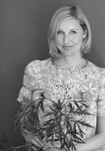
To continually develop the Boss Design colour palette, we work with interior stylist and consultant Sania Pell. We asked her to share some insights on her approach to colour palettes as an element of décor…
People often remark that colour palettes are ‘on trend’. Is it important to be aware of and/or follow trends when developing a colour palette for a commercial decor scheme?
It’s useful and good to keep an eye on trends. Often, when you are in the design industry these trends are absorbed naturally. I usually look to art for colour combinations though, so it’s more unique, but subconsciously trends may influence my art choices too.
One way to reference a colour trend you like in fashion, for instance, is to hint at it via the colour of a cushion or a chair. We are less likely to change furniture than clothes, but you can have a chair recovered a little more often in more unusual fabrics and colours to give your space a fresh look.
What psychological effect do you think colours have and how do they make us feel?
My way of working with colour is usually tonal, which I find is calmer and easier to live with. A mix of oranges, tans, pinks and corals, for example, works harmoniously to create a relaxing interior. To me, an interior should be a calm place and this tonal way of working helps create unity be it through blues, reds or creams.
What’s your philosophy on applying accent colours?
Accent colours are important to add a little tension to a scheme, or to push boundaries. This can be through the introduction of an accessory.
How do you balance base and accent colours when you’re developing a palette for a decor scheme?
My main scheme will be around a base colour and the rest is accent. So, 80 to 90% tonal and 10 to 20% accent.
As well as Boss Design, Sania’s clients include Tate, John Lewis, Elle Decoration, Farrow & Ball and other leading brands. Find out more on her website.
_
Boss Design, March 2023

Please wait while you are redirected to the right page...